Redesign of the leading ePaper platform in the North

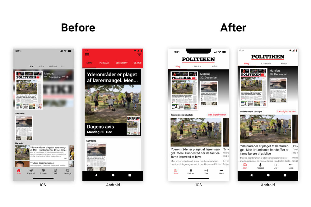
As the first in-house UX designer at Visiolink, I was tasked with redesigning their e-paper platform app, a product that had evolved over a decade with numerous extensions and little consistent framework. The code was outdated, the resources for a complete overhaul were unavailable, and both the Android and iOS versions lacked design alignment. My challenge was clear: modernize the interface while balancing technical limitations and aligning user experiences across platforms.
Process
My first step was to gather insights through workshops and discussion groups with clients, understanding their current needs and the future direction of the newspaper industry. Many of our clients struggled with the shift from print to digital and couldn't afford customized solutions. What they needed was a more polished, standardized version of the platform that could still feel tailored to their brand.
The discovery phase revealed that the existing app was too basic, and Android and iOS looked like completely different products. Starting with minimal design adjustments, we aligned the two platforms to create a cohesive experience. Initial changes sparked an increase in client interest and sales, proving that even a small facelift can make a big impact.
Wireframes & Prototyping
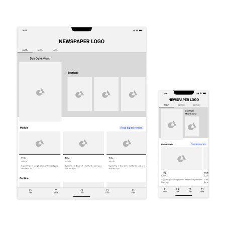
Using Figma, I created low-fidelity wireframes to present to clients and internal teams. This process allowed us to iterate quickly based on client feedback. Given that most of our users were on iOS, we prioritized its redesign, ensuring the new design met the needs of the majority before tackling Android.

Design System Development
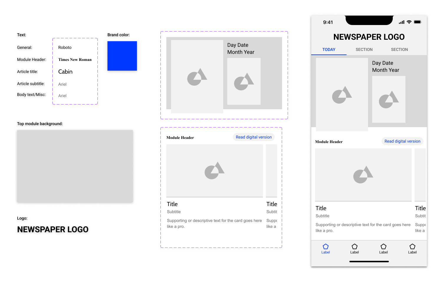
To streamline the design and development process, I created a flexible design system that simplified future customizations. It allowed the sales team to offer tailored prototypes for clients, making the sales process more effective by showcasing a near-final version of their app. Developers only needed to reference one source for all design specs, ensuring clarity and consistency across the board.

Results
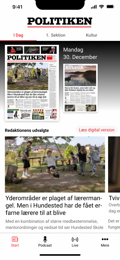
By implementing a cost-effec tive design refresh, aligning cross-platform designs, and creating a scalable design system, we significantly improved user experience and client satisfaction. The updated app sparked renewed interest from clients, leading to an increase in sales and setting a strong foundation for future development.
