Redesigning SPOTs Festival App
I undertook a complete redesign of the SPOT Festival app to bring it in line with the design and feel of the festival’s webpage, ensuring a cohesive user experience across platforms. Working within the constraints of the existing technical framework, I focused on modernizing the app’s interface without compromising design aesthetics. The goal was to improve the user experience while maintaining as many of the original app's functionalities as possible.
Landing Page Redesign
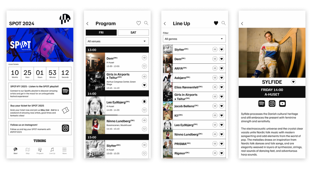
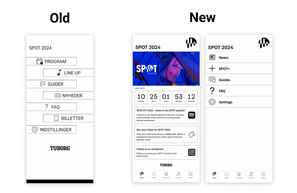
One of the key improvements was revamping the app's landing page, which previously consisted only of a simple menu. I transformed it into a dynamic space where SPOT can promote their annual playlist (which often went unnoticed), as well as highlight tickets and other relevant events before, during, and after the festival. This change not only made the app more engaging but also created a hub for festival-goers to discover new content.
Favorite & Filter System
The old favorite and filter system was cumbersome and unintuitive. I streamlined this feature, making it easier for users to find and organize their favorite artists, performances, and events. The new system offers a smoother, more user-friendly experience, allowing users to filter through events and save them effortlessly.
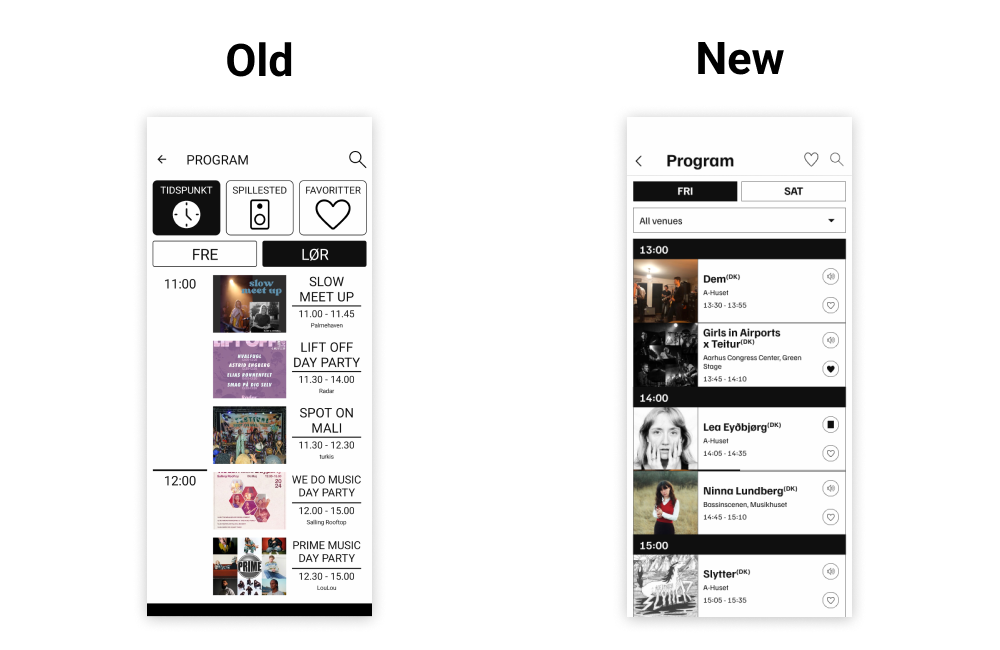
To enhance user engagement, I also added a feature that allows users to play audio snippets of the performing artists directly within the app. This helps users quickly discover new music and get a taste of the festival’s lineup.
Icon Overhaul
I also revamped all the app’s icons, ensuring a clean, modern design that aligns with the overall aesthetics of the festival’s branding.